Anyone who took a home-economics class in the 1970s or saw a poster taped to a school cafeteria wall in the 1990s knows what a food pyramid looks like. A wide base of bread and pasta, a narrower band of fruits and vegetables, then dairy and meat, and a tiny triangle of fats and sweets at the top. It is one of the most recognizable pieces of public-health graphic design in American history. It is also, as of January 2026, no longer the official picture of how the federal government wants us to eat.
I spent most of my career as a reference librarian, so when patrons would ask me what the government actually recommends for a healthy diet, I learned to pull the source documents rather than rely on memory. The recommendations have changed more than most people realize. It is worth walking through how we got from the old pyramid to the plate to the new pyramid that just landed last winter, because each version reflects what nutrition science (and federal politics) looked like at the time.
A short history of federal food guidance
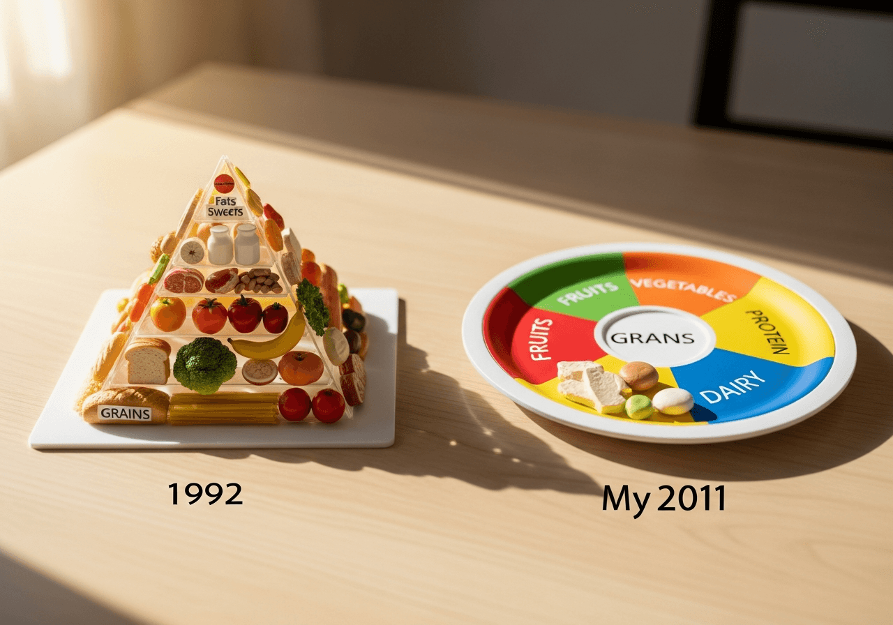
According to the USDA's own history, federal food guides go back further than most of us assume. There was the Basic 7 chart used during World War II rationing, the Basic Four that ran from 1956 to 1992, and then the original Food Guide Pyramid that the U.S. Department of Agriculture introduced in 1992. That first pyramid is the one most readers over 60 will picture immediately: grains at the base, fats at the apex.
It was revised in 2005 as MyPyramid, which traded the food groups stacked in horizontal layers for vertical stripes of color and added a little stick figure climbing stairs to remind everyone about exercise. It was a well-meant graphic, and it was widely panned. Critics said it was abstract and confusing, and the recommendations behind it were still being shaped, in part, by industry lobbying.
In June 2011, the USDA retired the pyramid altogether and introduced MyPlate, a simple dinner-plate diagram divided into four wedges (fruits, vegetables, grains, protein) with a small circle for dairy on the side. MyPlate stayed in place for nearly fifteen years and is still familiar to anyone who has wandered through a doctor's office waiting room.
What changed in January 2026
On January 7, 2026, the USDA and the Department of Health and Human Services released the 2025–2030 Dietary Guidelines for Americans, along with a new graphic that the agencies are calling, simply, the New Pyramid. Coverage from the National CACFP Association and the Center for Science in the Public Interest both note that the new document is roughly six pages long, a striking change from the more than one hundred pages of the previous edition.
The graphic itself is sometimes described as an inverted pyramid, with whole, minimally processed foods given the most visual weight and ultra-processed foods pushed to the bottom point. The official materials live at realfood.gov rather than the older choosemyplate.gov address, which has been folded into the new site.
It is worth noting that the development process drew unusual attention. The 2025 Dietary Guidelines Advisory Committee, formed in 2022, submitted its scientific report in December 2024. Several outlets, including Stanford Medicine's nutrition program and the Harvard T.H. Chan School of Public Health's Nutrition Source, reported that the final guidelines departed from parts of that committee's recommendations. Whether one views that as helpful streamlining or as bypassing the science depends, frankly, on which commentary you read.
What the new guidance actually says
Setting the politics aside for a moment, here is what the 2025–2030 guidelines emphasize, according to the released materials:
- Prioritize whole, minimally processed foods over ultra-processed ones.
- Choose high-quality protein, including lean meats, poultry, fish, eggs, beans, and nuts.
- Include healthy fats, particularly from plants and seafood, rather than treating all fats as something to avoid.
- Fill out the diet with fruits, vegetables, and whole grains.
- Limit added sugars and refined carbohydrates.
If that sounds less like a strict pyramid and more like a set of instructions, that is the point. The plate and pyramid imagery is meant to be a doorway into the longer recommendations, not a rigid prescription.
The Harvard alternative is still around
For readers who remember the older article on this site, the Healthy Eating Pyramid from Harvard is still being published, although in updated form. The Harvard T.H. Chan School of Public Health now promotes the Healthy Eating Plate, which they introduced in 2011 as a counterpoint to the USDA's MyPlate.
According to Harvard's own comparison page, the Healthy Eating Plate differs from the federal version in a few specific ways. It distinguishes whole grains from refined grains rather than lumping them together. It encourages fish, poultry, beans, and nuts as protein sources while urging readers to limit red meat and avoid processed meat. It treats healthy oils, especially olive and canola, as their own category. And it suggests water as the default beverage, with milk and dairy limited to one or two servings a day.
Harvard makes the case, on its Nutrition Source site, that the Healthy Eating Plate is built strictly on peer-reviewed research and is not subject to the kind of industry pressure that has historically shaped USDA guidance. That is a reasonable point to be aware of when comparing the two.
Why any of this matters after 60
For readers in their 60s, 70s, and 80s, the practical question is not which graphic is in fashion this year. It is what to actually put on the plate at lunch. A few things in the new guidance are worth flagging for older adults.
The renewed emphasis on protein quality is genuinely useful. Geriatric medicine has been clear for years that older adults often under-eat protein, which contributes to the gradual loss of muscle that doctors call sarcopenia. A diet that includes fish, beans, eggs, and lean poultry at most meals, rather than relying on toast and tea, is in line with what most dietitians who work with seniors recommend.
The shift away from ultra-processed foods is also worth taking seriously. Several studies published over the past few years, including ones discussed in the National Institutes of Health's Nutrition for Precision Health work, have linked heavy ultra-processed food intake with worse cardiovascular and metabolic outcomes. Cooking simple food at home, even just two or three days a week, is one of the most effective changes most of us can make.
And the gentle reminder about whole grains is not new but is still sound. Half your grains as whole grains was the line in the 2005 pyramid, and twenty years later it is still a reasonable target, particularly for blood sugar management.
A practical takeaway
If you do not feel like sorting through the federal site, here is the short version that any reference librarian would feel comfortable handing over the desk: cook real food, eat plants and lean protein at most meals, drink water, and treat sugar and ultra-processed snacks as occasional rather than daily. The graphic on the wall has changed five times in my lifetime. The underlying advice has barely moved.
For readers who want to look at the source documents themselves, the 2025–2030 Dietary Guidelines and the New Pyramid graphic are at realfood.gov. The Harvard Healthy Eating Plate is on the Nutrition Source site at the T.H. Chan School of Public Health. Both are free, and both are worth a careful read.