John Deere logo has been revolving over the years. Overall, there are eight logo versions in over 170 years. Changes to the John Deere logo through the years illustrate the story of a changing company. This blog will let you see John Deree Logo through the decades.
John Deere made his first plow for Midwest farmers in 1937 from the steel of a broken saw blade. Today, Deere&Company is global, and though the company works in a variety of industries, its identity is still synonymous with a leaping deer.
Introducing the Leaping Deer Trademark – 1876
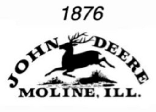
Firstly, the leaping deer trademark was first registered in 1876, though the company had already been using the logo for a number of years. At the time, the company was known for producing what was referred to as Moline Plows because the plows were manufactured in Moline, Illinois.
The first registered trademark pictured a deer jumping over a log. The words “JOHN DEERE” were printed in an arch over the deer and the words “MOLINE, Ill.” was printing in all caps beneath the deer. While future logos would feature the native North American white-tailed deer, this first logo depicted a deer common in Africa.
Second John Deere Logo, 1912
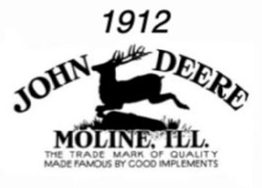
The second John Deere logo was registered in 1912, though again it was used for a number of years prior. The new logo reflected the company’s growth, as it had acquired other companies that manufactured agricultural products. In this second version, the deer were drawn with more detail. The words printed above and beneath the deer remained the same, but a slogan was included across the bottom: “The Trade Mark Quality Made Famous by Good Implements”.
Third John Deere logo, 1936
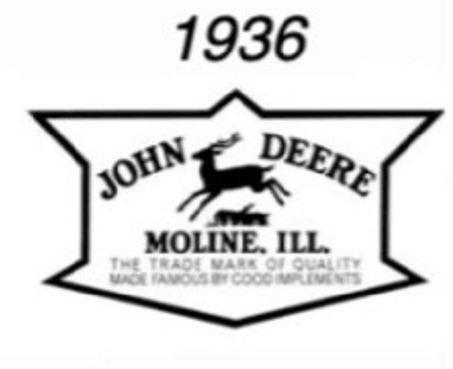
Thirdly, the John Deere logo was registered in response to the company’s standardization committee. The goal was to simplify the logo to make it better adapted for stenciling onto products. As a result, the detailed deer was filled in as a solid silhouette and its legs were outstretched. The lettering remained the same, but bolder and framed with an angular border. According to the John Deere website, these changes streamlined the logo and made for a more recognizable profile.
Fourth John Deere logo, 1937
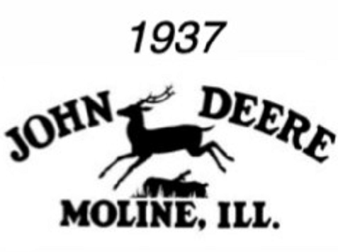
One year later, the company marked its centennial with a new, simpler logo. The slogan and border were removed and accordingly, the image and other lettering remained the same.
Fifth John Deere logo, 1950
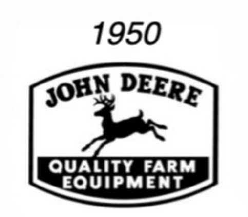
Significant changes were made to a new logo, first registered in 1950. The log beneath the leaping deer was removed and the deer’s antlers were turned forward while his tail was turned up, depicting a white-tailed deer. “JOHN DEERE” was printed in an arch across the top in a square-sans serif font. “MOLINE, ILL.” was replaced with “QUALITY FARM EQUIPMENT” across the bottom in sans serif. A border had four sides with slight curves on the top and bottom.
Sixth John Deere logo, 1962
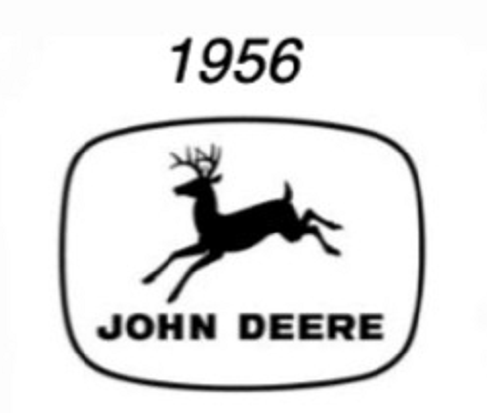
The sixth logo appeared in 1956, but was not registered until 1962. This logo was a simplified version of the fifth logo. The slogan “Quality Farm Equipment” was removed. The four corners of the border were rounded and “JOHN DEERE” was printed beneath the bounding deer in a modern type.
Seventh John Deere logo, 1968
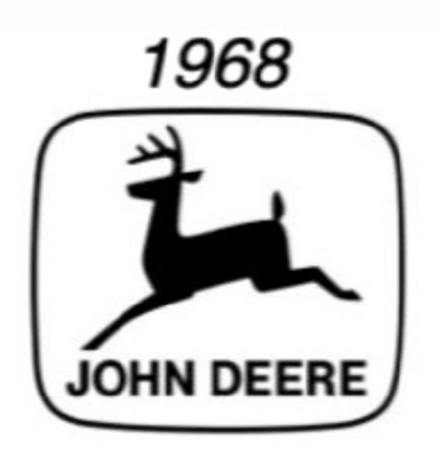
The seventh logo was made in 1968 and was described by Deere&Company as clean-cut and contemporary. The goal was to broaden the logo’s readability and appeal. The deer silhouette was depicted as a side profile with two legs instead of four and a 4-point set of antlers. The type was modified Helvetica. The size of the deer increased and the border was slimmer.
Eighth John Deere logo, 2000
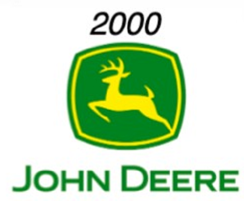
Above all, the eighth John Deere logo was introduced in 2000, 163 years after the first plow was handmade in a blacksmith?s shop. Changes to the deer include sharper antlers and more muscularity. Rather than landing, the deer is pushing upward. A curved, four-sided border frames only the deer with “JOHN DEERE” beneath. Moreover, the words and background are green, and the deer and border and bright yellow, resembling construction colors.
Changes in the John Deere logo reflect an effort to show that company’s identity for what it was during a particular period and where it saw itself growing. The John Deere logo is one of the most recognizable logos because each new version has preserved the company’s past while focusing on its intentions for the future.
References:
Deere: History of the John Deere trademark
Antique Farming: John Deere Tractor Histroy

