The field of catalog designs and innovations has never been more exciting. Graphic designers and artists are experimenting with new approaches to the standard mail order catalog designs we’ve all come to expect. Some involve small shifts in the look of a traditional catalog, while others challenge the whole concept of a mail-order catalog.
Here are ten innovative ideas to inspire you when it’s time to design your next catalog.
10. Orvis

A far cry from the typical cluttered catalog cover, this catalog lets the pup’s winsome expression and the short subtitle say it all. Using a single image, especially a close-up like this one, maybe all the innovation your catalog needs to stand out from the rest. They have amazing catalog designs each year.
9. Troll Beads

There’s no need to use a photo at all on the cover of your catalog. This sample is part of a growing trend of turning a catalog cover into a mood-creating work of art.
The leather-look cover invokes feelings of ancient wisdom and something beyond the ordinary. In contrast, a photo of beads (what this company makes and sells) would disappear into the expected and therefore unnoticed in a pile of other catalogs.
8. Wow Playgrounds
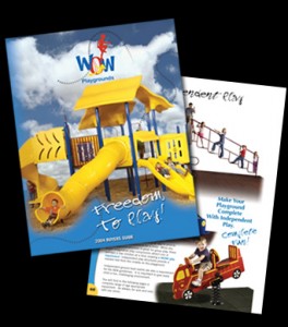
Too many catalogs get trapped in the “Box-Image-Text” layout and forget that they have the entire page available. Wow Playgrounds not only steps outside of that design structure, but they have also created an organic mix of image and text. Then they added what looks like hand-written notes, creating a friendly, accessible feel. They always have catalog designs to look forward to in every issue.
7. Beautiful Trash
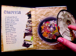
With the rise in digital catalogs delivered on DVD, CD-Rom or even Memory Sticks, catalog marketers have a chance to make a powerful first impression with the packaging.
That’s what this company did by designing a container that fits with the company name and draws recipients in from the moment they receive the package.
6. Sessions

California ski gear company Sessions has disposed of the standard catalog page layout entirely. This was replaced with color-focused designs reminiscent of street art. Photos of models wearing the snow gear are worked into the bright backgrounds. This provides information about the product without looking like an ad.
5. Super Cars Asian
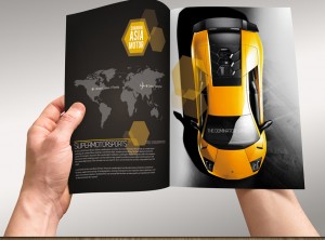
Super high resolution extra large pictures, taken at unexpected angles combine to create a catalog that looks like it’s speeding right out of your hand.
Consider the strongest features of your products. Take note of the wow factor — and use large high resolution images to get readers excited about your products.
4. Gelati Aloha
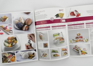
Sure, anyone can include pictures of their products, but what about pictures of the ingredients? That’s what the creators of this gelato catalog did. And the results are mouthwatering!
Not a food catalog? Consider adding images of exotic settings where your products are created, or where the raw materials are gathered/grown/harvested. Or show the steps in the manufacturing process. These “behind the scene” glimpses draw readers in and make them feel more a part of the process.
3. MCD Innovations
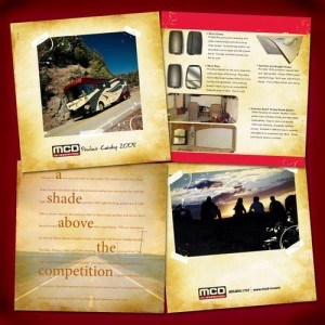
Notice the dynamic layout, and the use of fonts and color to create an artistic visual experience in this B2B catalog.
Some catalogers may believe innovative designs are only for “exciting” products like sports cars or fashions. But this innovative design from a company that deals in sunshades for tour buses proves that any catalog can be more appealing, regardless of your product or service.
2. Book People

When a customer goes into a store, the staff they meet can make all the difference in the world. Bring that personal touch to your catalog by letting your staff talk to your mail-order customers, too.
This bookstore catalog features a different staff member on each layout. With a quirky Q&A box and a “Favorite Book”. The facing page describes books that might appeal to someone like that staff member. Spending nearly half of a catalog on staff might seem excessive to some. But if it brings the in-person experience to your far-away prospects and customers, it just might be worth the paper and postage.
1. Take it outside the book
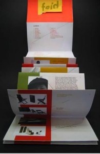
This beautiful catalog for modern chairs is an example of the growing trend toward catalogs that don’t look like traditional catalogs at all.
If your demographic is artistic, tech-focused, or open to new ideas, consider catching their attention by designing a catalog that breaks the bounds of standard pages and layouts.

